Pet Adoption Platform
A mobile app connecting adopters with local shelters and adoptable cats, from shelter discovery and browsing to creating a listing.
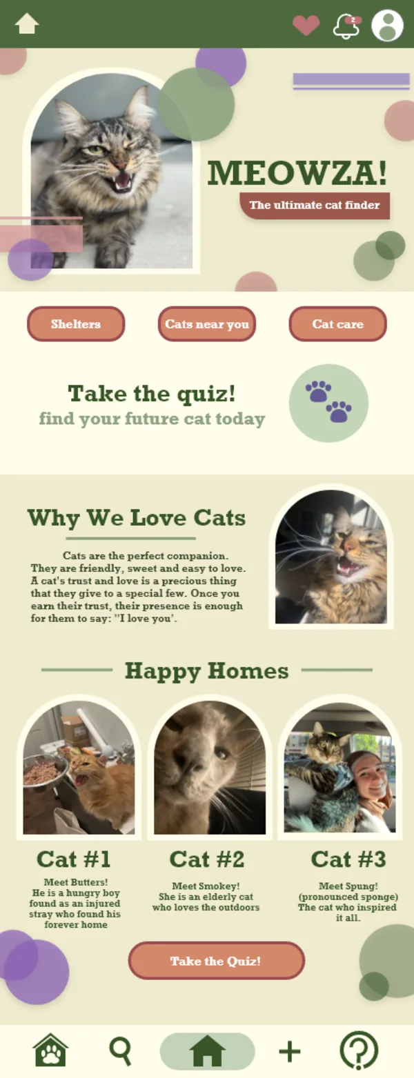
The brief
San Jose Animal Care Center and Petfinder both organise adoption around filters: breed, age, weight. That assumes the adopter already knows what they want. I interviewed ten cat owners, and most had not started with a specification.
MEOWZA is built around matching rather than filtering. It covers both sides of the process: adopters looking for a cat, and shelters listing one.
Research
Ten interviews with cat owners, and a competitive review of San Jose Animal Care Center and Petfinder. I interviewed owners rather than people currently searching, because owners can say whether the match worked out.
Decisions
-
The home screen leads with the quiz
Take the quiz sits above the fold, repeats as the closing call to action, and has its own slot in the tab bar. A filter panel only works if you can name what you want, and most people I interviewed couldn't.
-
The quiz asks about lifestyle, not just appearance
It opens with appearance: size, colour, hair length, patterning. Then lifestyle: other pets, activity level, available space, who else lives there, whether there are children, outdoor access. Breed, age, gender, mousing ability and neuter status come last, as optional filters. The lifestyle answers do most of the matching.
-
Results show breeds, then individual cats
The quiz returns a ranked list of breeds with descriptions, followed by a filtered carousel of individual cats. The ranking explains the reasoning behind the match. The carousel gives the adopter something to act on.
-
Three shortcuts for three separate tasks
Shelters, Cats near you and Cat care sit together near the top. Browsing organisations, browsing animals and reading care information are different tasks, so each gets its own entry point.
-
Happy Homes shows completed adoptions
The section below the quiz shows cats that have already been adopted, with names and short descriptions instead of breed and weight. Butters was found as an injured stray. Smokey is elderly and likes being outdoors. Every cat shown is real: my friends' cats, and my own.
-
Listing a cat sits in the tab bar
The + is in the persistent bar alongside search and home, rather than behind a separate shelter login. Shelters and adopters use the same app.
-
A design system, specified before the screens
Colour, typography, iconography and reusable components (cards, filter chips, tags) were built as a style page in XD first. Arched frames repeat around every photograph. Eight screens in the final prototype.
Testing
Five people tested the prototype. The clearest finding was that testers kept trying to tap the tags. The tags were pill-shaped and filled, which read as buttons, so testers expected them to respond. They were labels.
I redrew them to read as labels rather than controls. The change was small, and it stopped people spending taps on an element that couldn't answer.
Where it goes next
All ten interviews were with adopters. I didn't speak to any shelters, so list a cat was designed without input from the people who would use it. That's the next round of research.